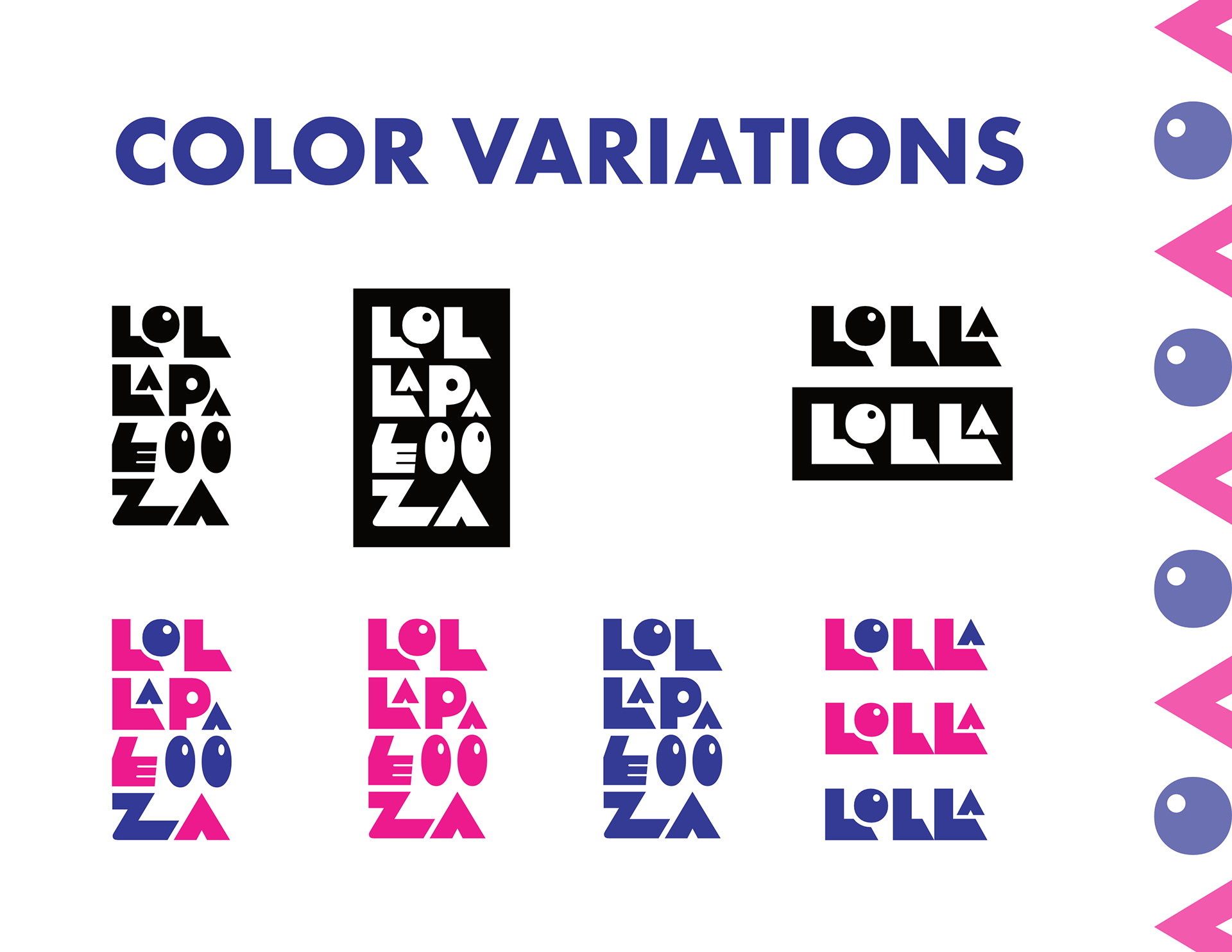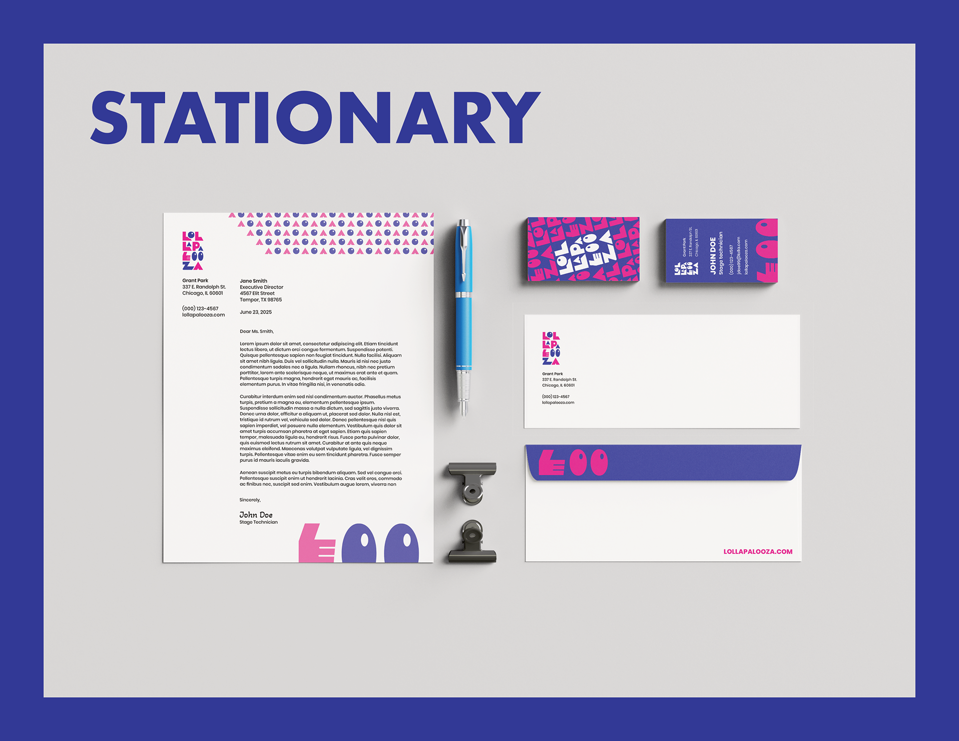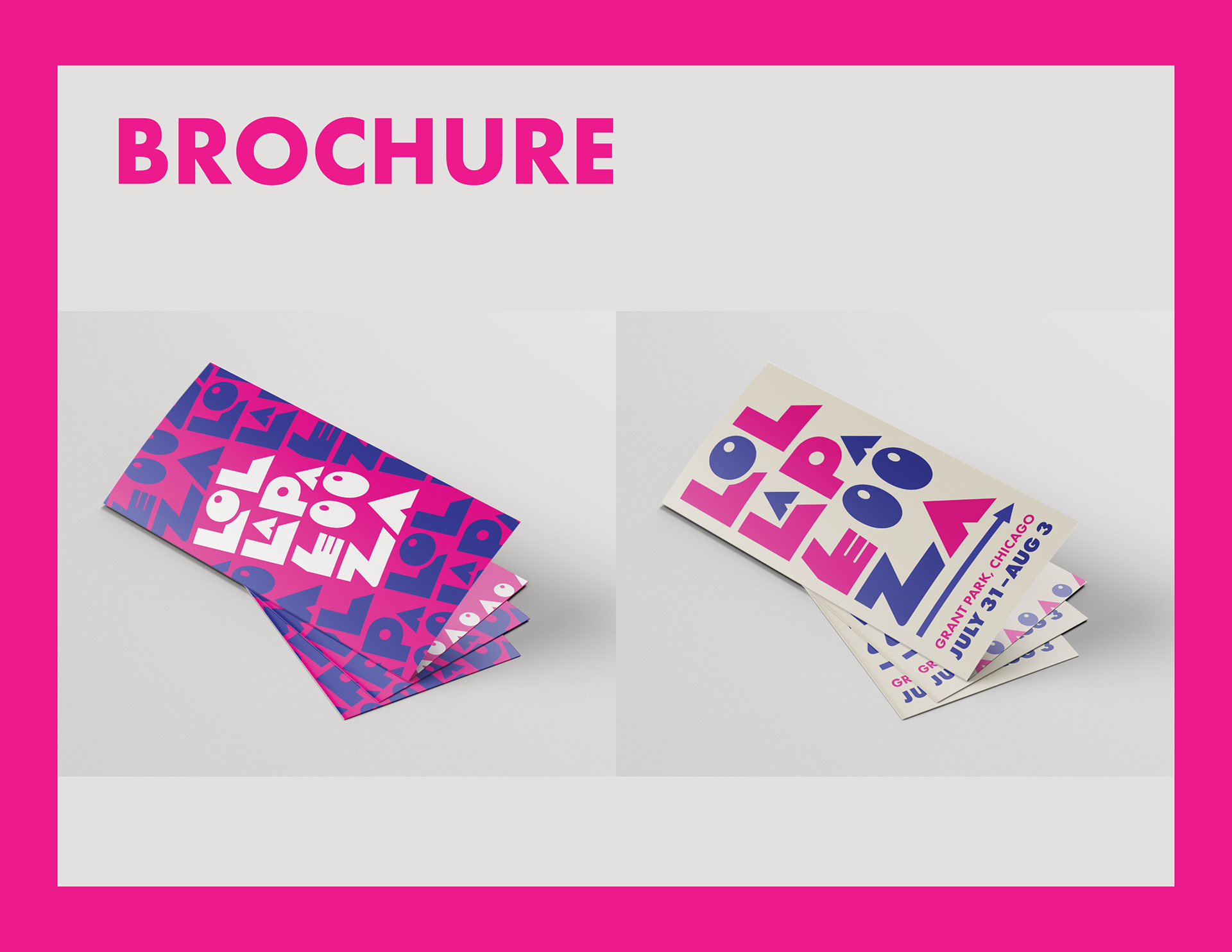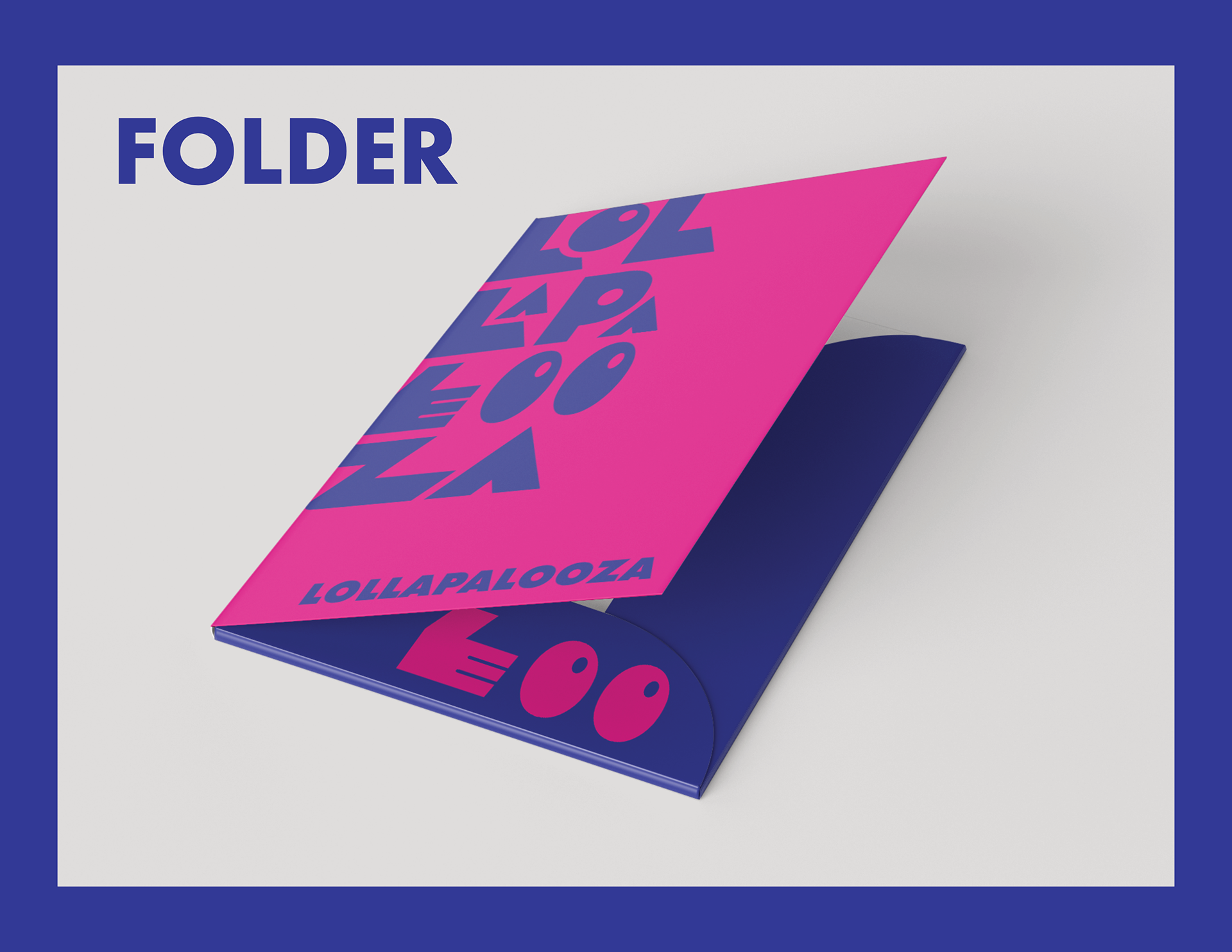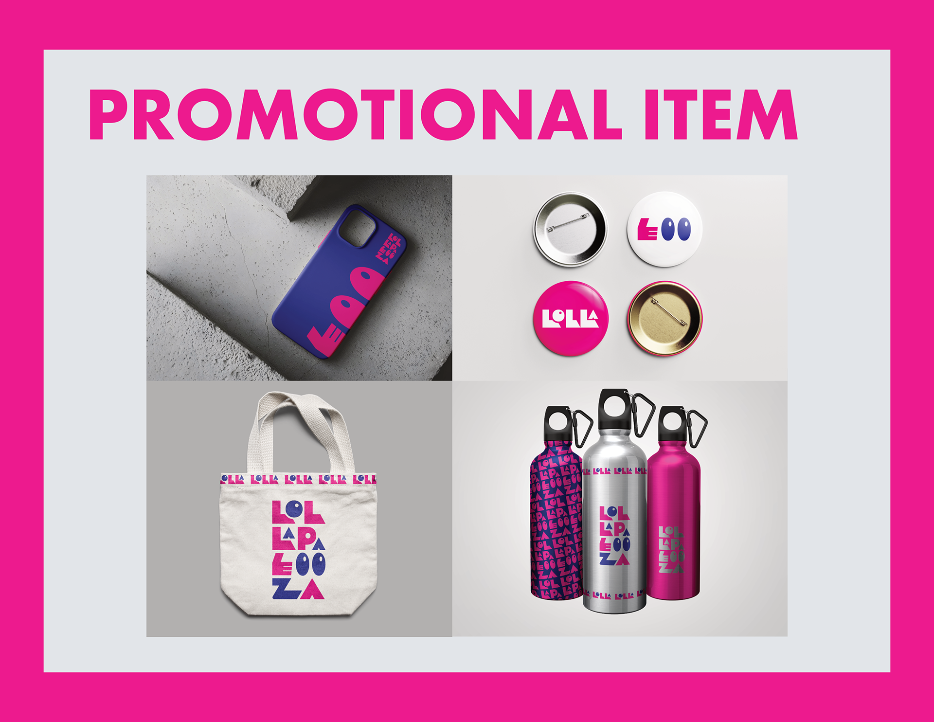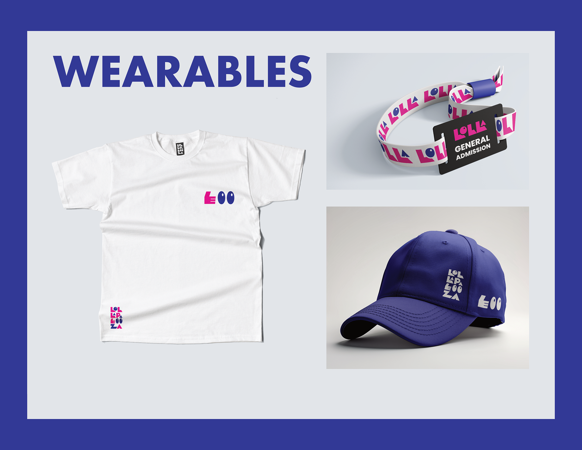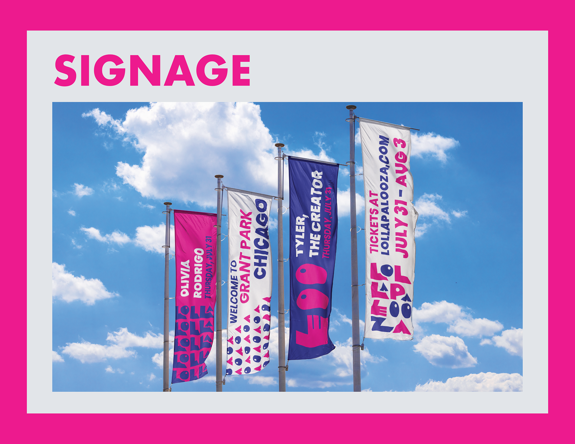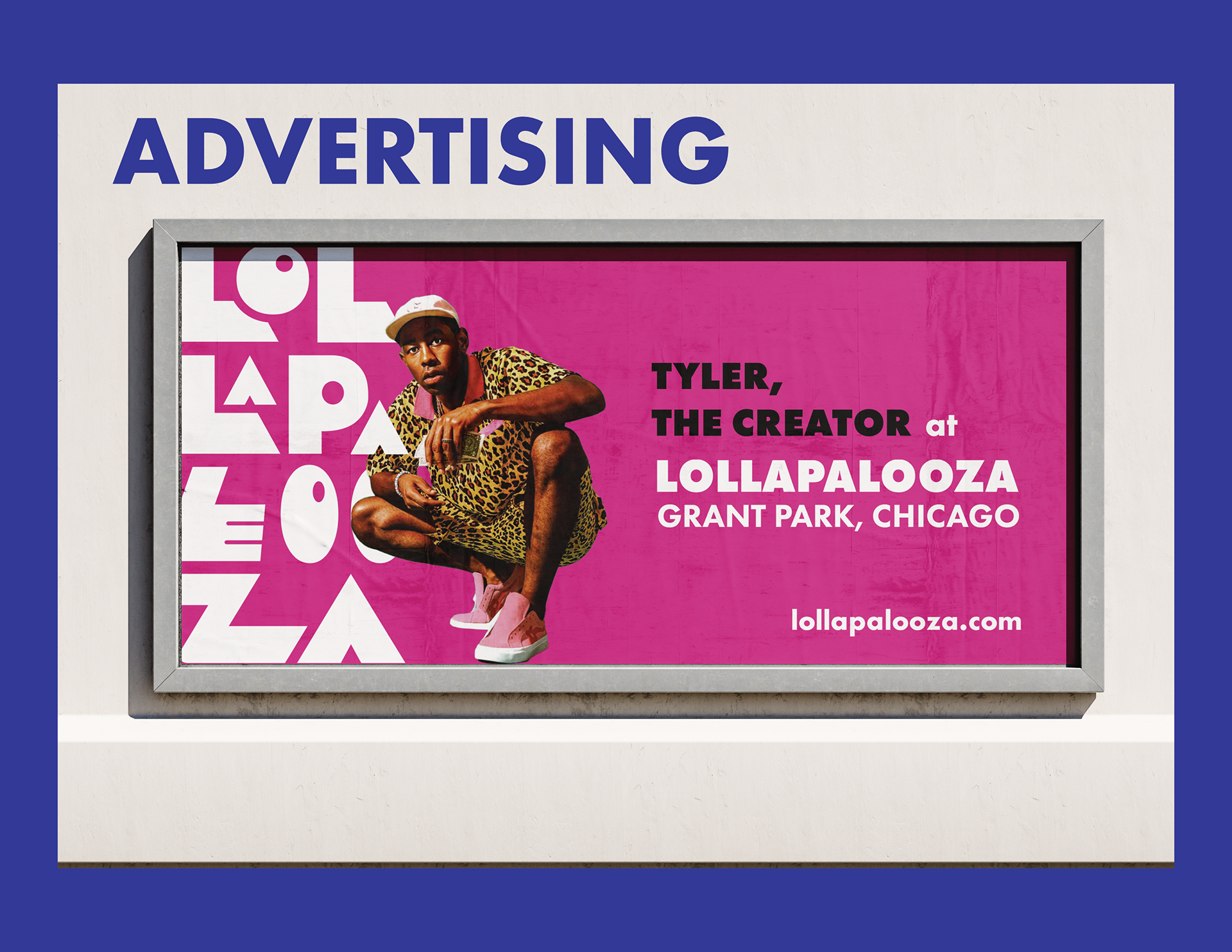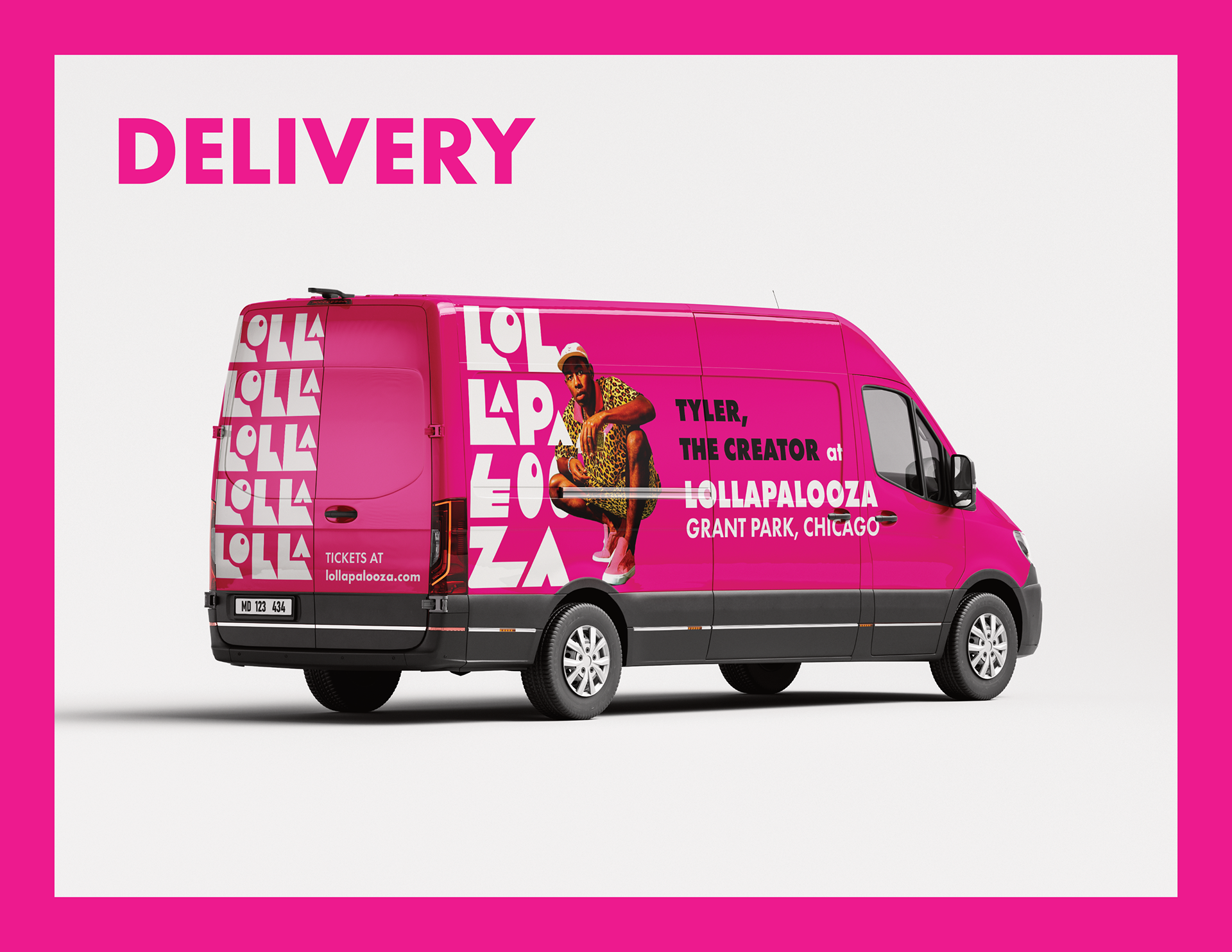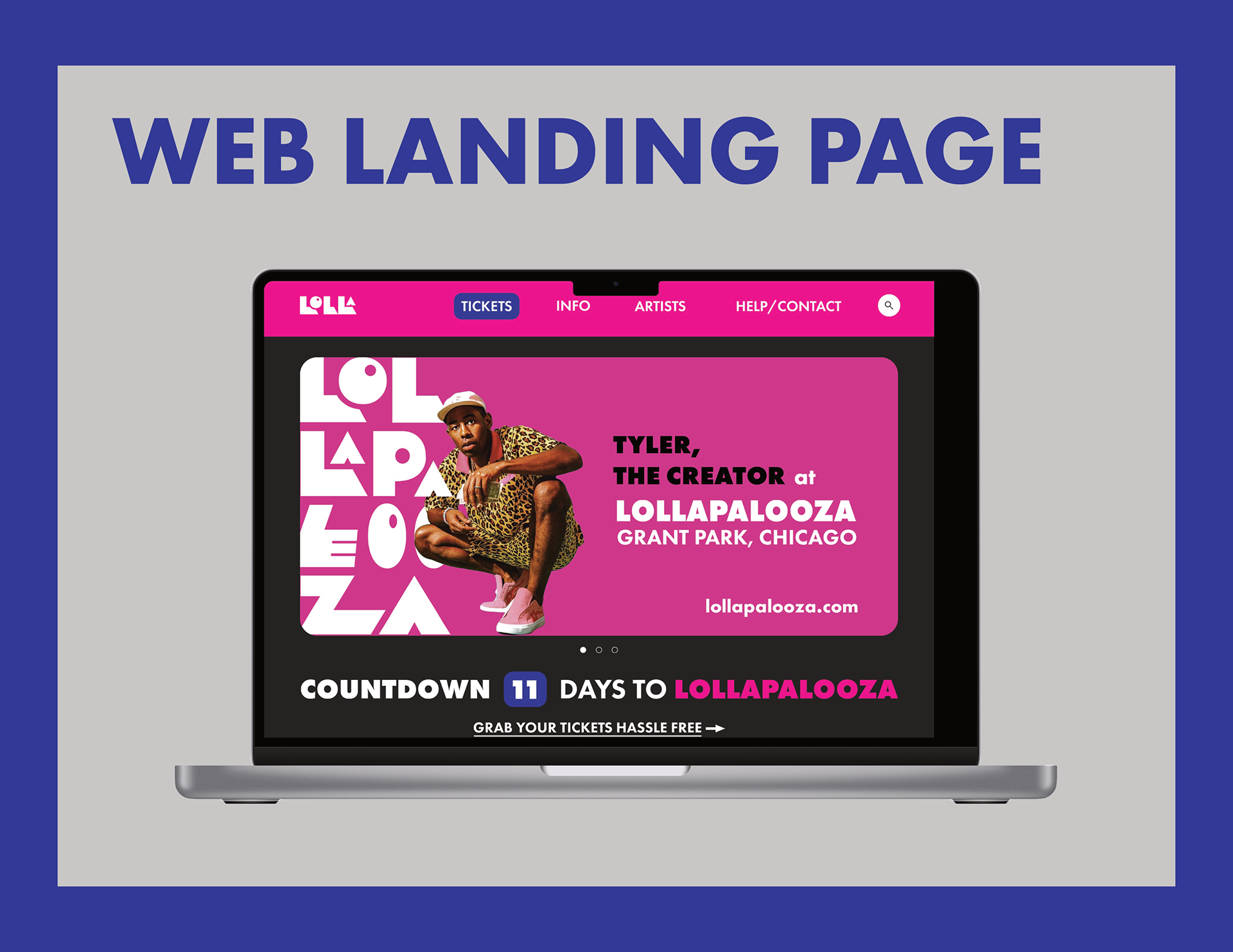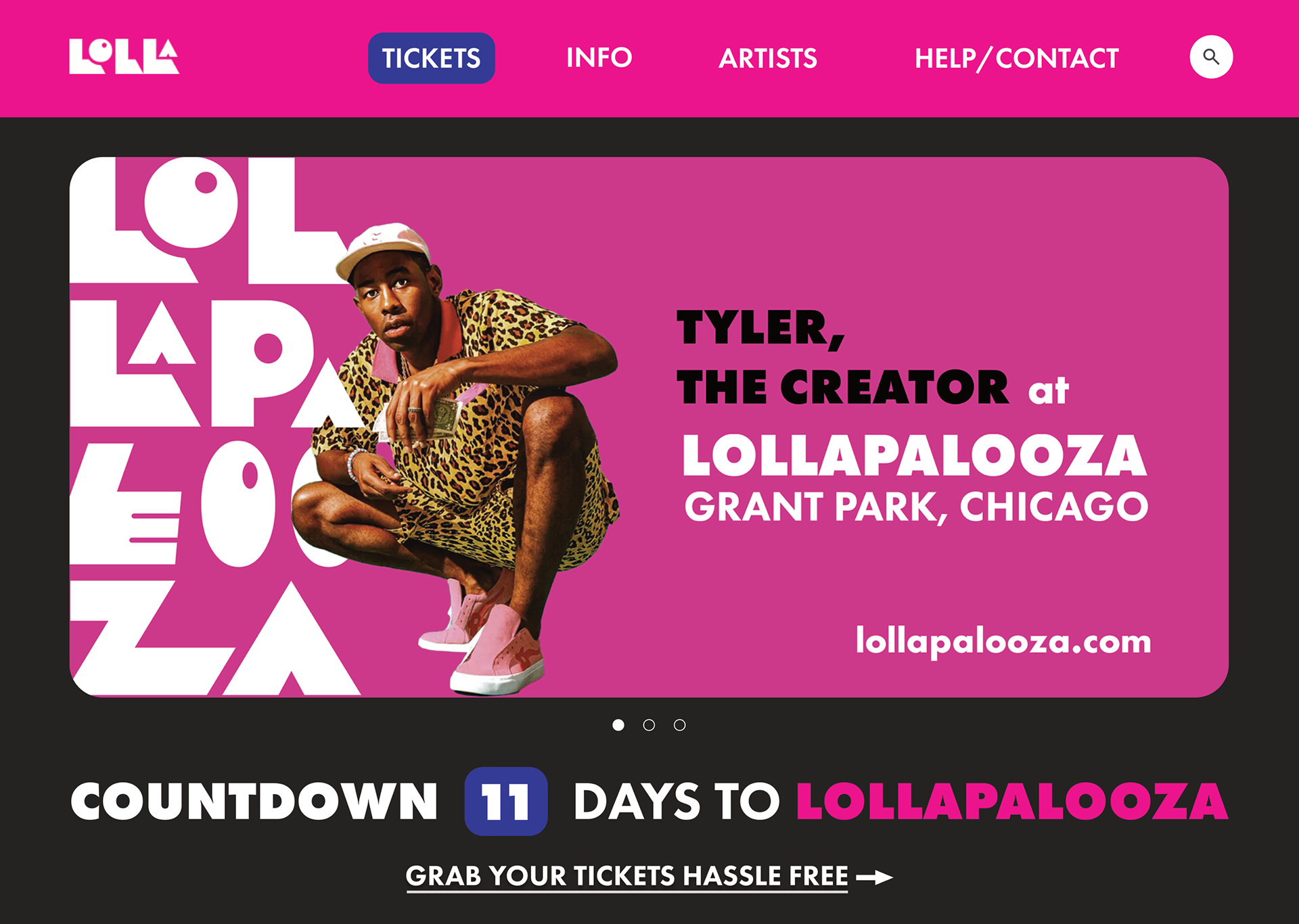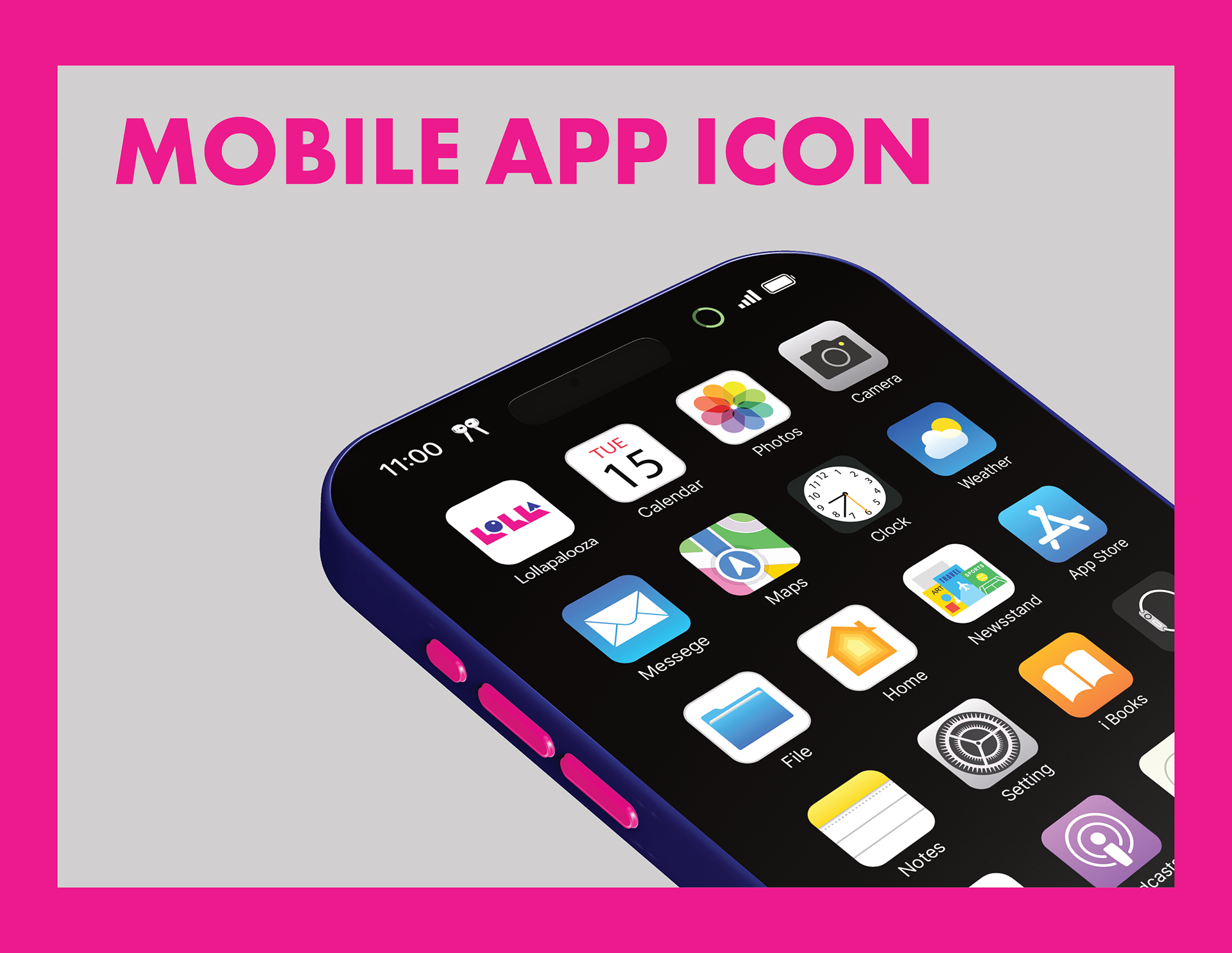
A brand identity project where I was tasked to take an existing brand and rebrand it from scratch, making sure that my creative direction has to be distinct from the original look of the brand.
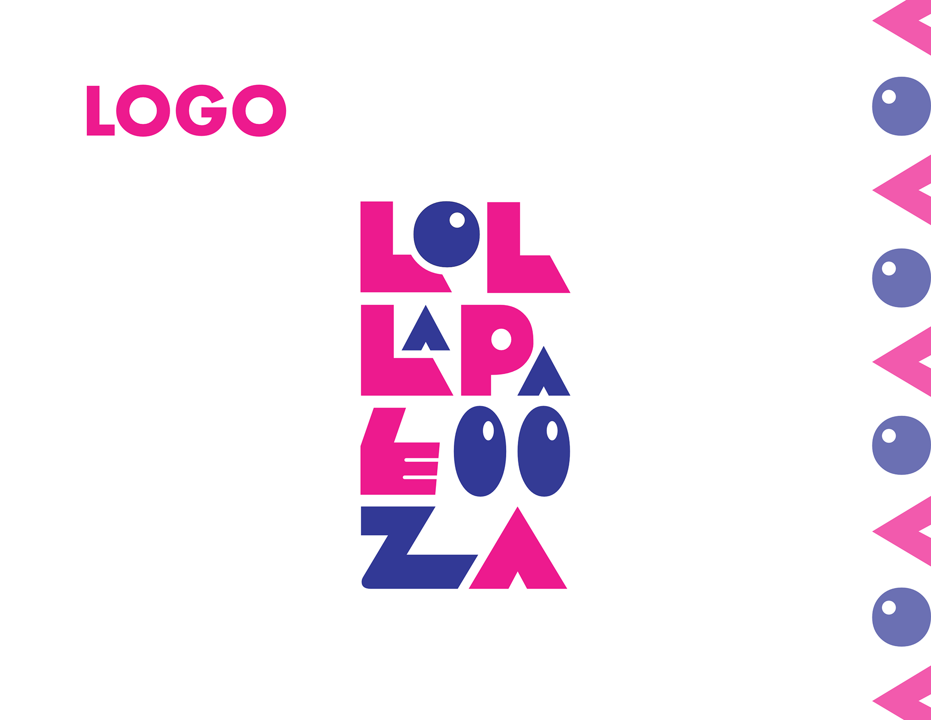
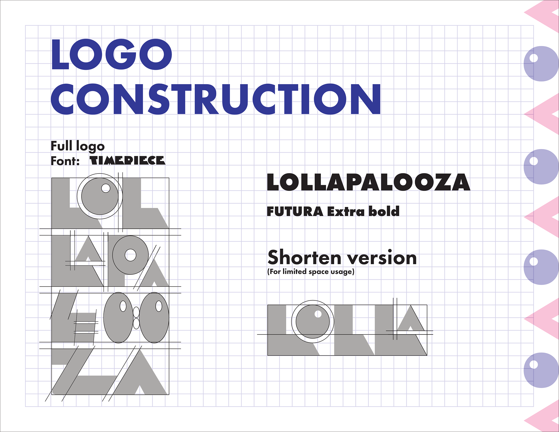
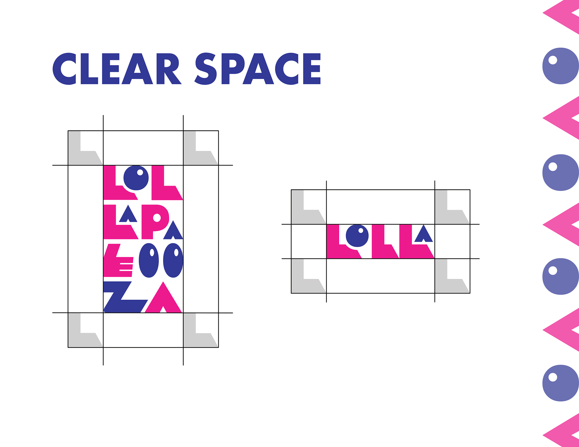
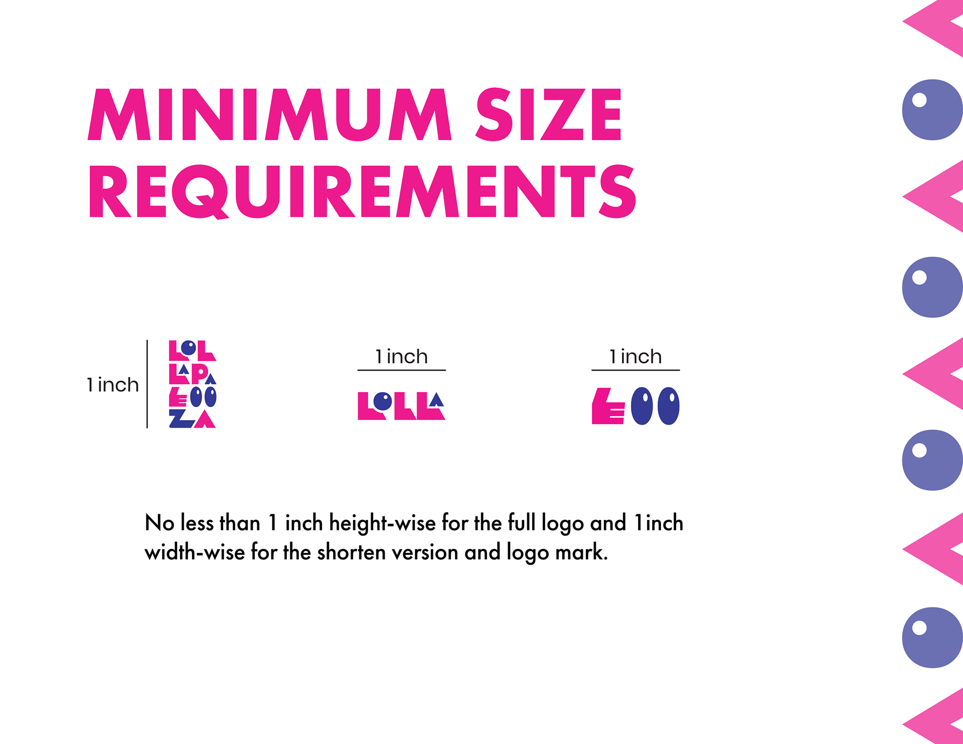
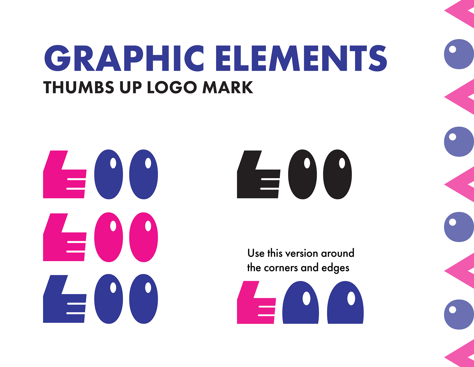
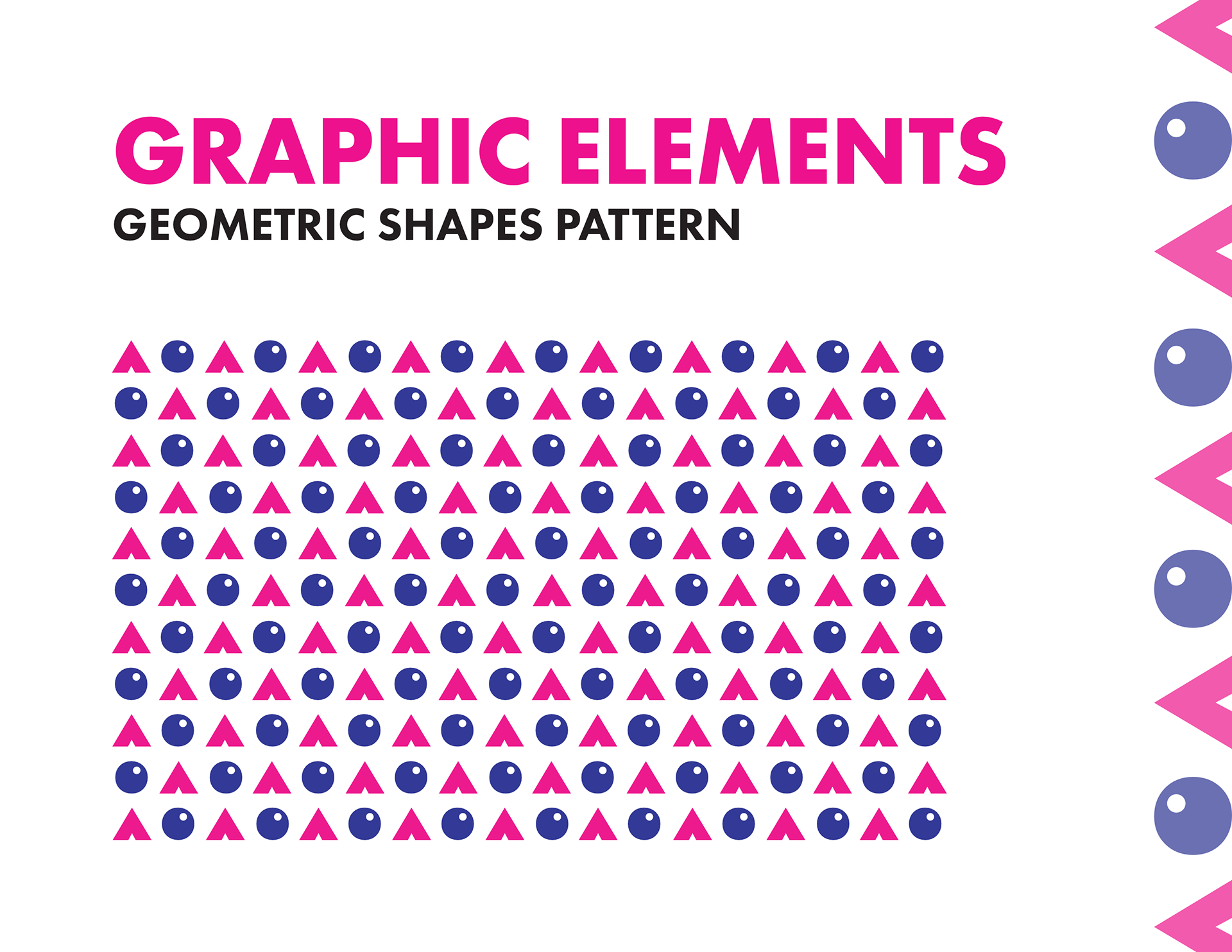
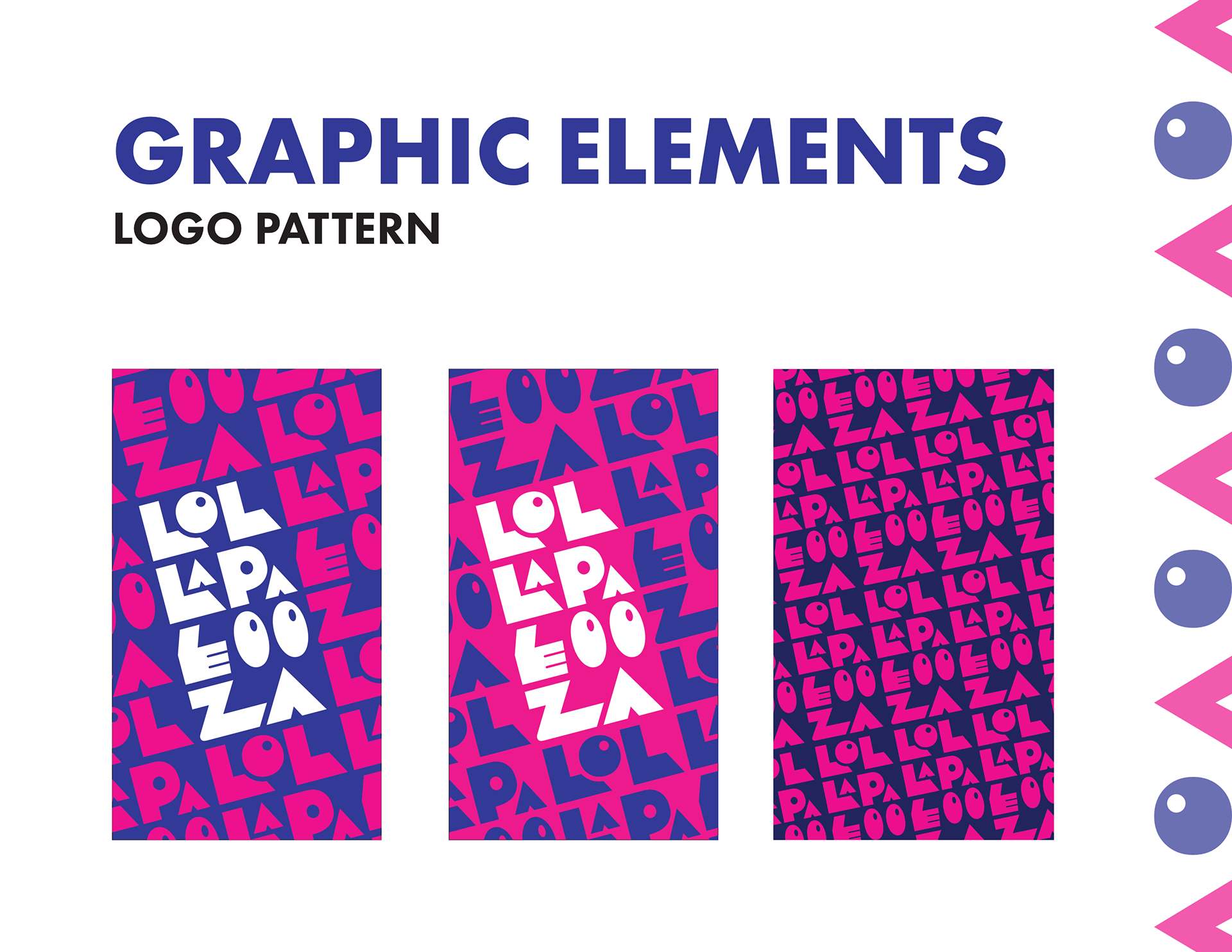
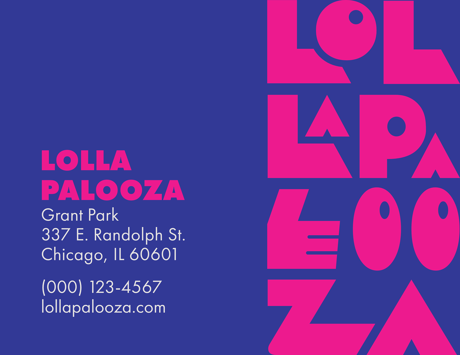
Lollapalooza’s branding stood out with their rounded and organic logo, along with fun and dynamic illustrative elements. Hence, my rebranding approach was “geometric”. Using a geometric font and just shapes to create patterns, my goal was to create a brand identity that is just as fun.
This project relied heavily on my own research and understanding of Lollapalooza as a brand. It was an opportunity to explore how to stay true to a brand’s mission and aesthetic while using a different creative approach.